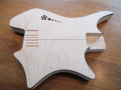
The past weeks, I have been toying with different f-hole designs and by collaborating with my wife, I arrived at something eventually. I wanted a play on my logo (which is featured all over this site, with the ‘.’ and ‘*’. I started with flowing designs that started with a dot and moved via a wave to the star. But this didn’t really balance out and by shifting the order, the relative sizes worked out better. The decreasing size holes was originally also following a wave shape, like the stem of a flower (credit the wife). Then, to make it more “masculine” I put them on a straight line. I had a helper line going through them when I was drawing and as it turned out, it looked better with the helper line than without it… So, here it is:

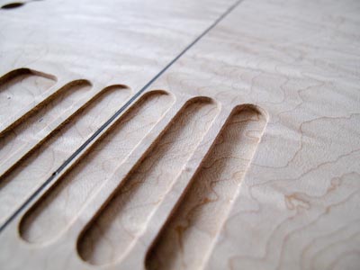
I also routed recesses for the bridges today.

They go from 1 mm in the middle, to 1.5 and 2 mm deep. This will allow me to have a similar height of the saddles although the actual string heights from the surface differs. Additionally, having the base plates recessed gives an exclusive look.


